


Color meanings: pick the right one for your IKEA covers
So, you've decided you want to change the look of your interior and extend the life of a loved IKEA furniture piece, but now you are stumped by the variety of colors and materials we offer. What color would look the best in my living room? Should I pick warm or cold colors? What do different colors mean? What do the colors I choose say about me?
Do not fear! We know that an abundance of color choices coupled with a lack of knowledge of how the colors will look in your house can quickly turn this exciting chance to personalize your home into a dreaded process. We offer a wide variety of IKEA slipcover colors and fabrics, so you are bound to find a variation of your personal favorite. Artists, interior designers and even psychologists have long analyzed what different colors can mean in the context of homes. If you want the furniture covers you pick to send a message and ensure your furniture has the perfect vibe, this short guide will give you all the knowledge you need.
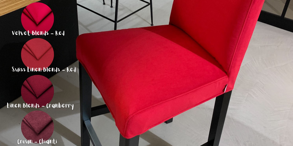
Red
While everybody knows that red is the color of passion, it’s not just a nice saying. Studies show that it stimulates the brain and raises the pulse rate, which makes red objects stand out. If used in the right measure, it can be a pure and strong color that highlights your favorite centerpieces, like an armchair by the fireplace. However, overuse can make a room feel hostile and tiring. Also note that red, like orange, is said to increase appetite, making it perfect for dining rooms and great for IKEA chair and bar-stool slipcovers.

Green
The most balanced color is green, a bridge between the warm and the cold colors. Green represents life, the living world and untamed nature. Used in the right way, it brings harmony and peace. Green is soothing, relaxing, and youthful, making it perfect for bedrooms and your IKEA bed frame covers. Different shades, tints, and hues of green have different meanings. The dark green fabric makes you think of wild forests with an almost intense vitality, while green bay is a lot softer and peaceful.

Blue
It is known that blue is the color of sky and water. A room with many shades of blue will have a calm and refreshing atmosphere. Strong blue stimulates clear thought, while soft blue relaxes the mind. Strong association with the ocean, rivers, lakes and all things water make blue a good idea for any room, when used in moderation. Do not overuse it however, because it can make a room seem cold, melancholic or lacking in emotion.

Yellow
To make people feel confident and optimistic, you should use some yellow. It is the color that can stimulate and invigorate. It stimulates our nerves, glands, and brain, making us more alert and energized, and has cultural associations with the sun, light, brightness and gold. Though paler yellows can certainly have a modest uplifting effect and work in most rooms, vibrant yellow is typically used with caution by designers, as it’s seen as the color of sensationalism and excess.

Orange
As a compound color, orange both mixes and mellows down the meanings of yellow and red. A bright orange grabs attention but is not as aggressive as red, while pastel variations such as coral and peach can make a room feel welcoming, relaxing and warm, making it perfect for living rooms, hallways and dining rooms. Just perfect for your IKEA furniture covers!

Grey
If you want a professional and intellectual look, we recommend using grey. It is neutral to the extreme, the only color that has no psychological connections when combined with others. It is the perfect neutral if you want to tone down a room, as it can moderate brighter hues and truly pull a color scheme together. Heavy use of dark grey without some bright spots however will transmit fear, lack of confidence or even depression.

Black
Black is the right color for getting a sophisticated and elegant look. Black is a definite color. It is sleek, modern and to the point. Used in contrast with bright colors – particularly with white or yellow – creates energy and exciting contrast. It can further convey authority, boundaries and mystery, but on its own it can be depressing and dampen the mood. It works in any room, but should be used in moderation.

White
On the other side, there is white, which expresses purity and cleanliness. It has an illuminating effect, helping our minds to focus and aiding in organization, making it good for kitchens (your IKEA dining chairs) and home offices. It goes very well with black due to the high contrast and it can also be used to flesh out more stimulating colors. However, too much white can make a room feel overly sanitized, impersonal and cold.
Now that you know what each color means, you can easily work out which upholstery cover works best. Either you choose Natural in Yellow color slipcovers or settle with safe and durable Heavy Duty in Grey, our fabric covers for your IKEA model furniture will help you set the tone.